
WSIB Mobile
A mobile solution for WSIB claims — developing a strategy to translate the existing, paper-based claim process into a more effective mobile process.
A mobile solution for WSIB claims — developing a strategy to translate the existing, paper-based claim process into a more effective mobile process.
A mobile solution for WSIB claims — developing a strategy to translate the existing, paper-based claim process into a more effective mobile process.
OVERVIEW
During the summer of my third year of university, I interned at the WSIB Innovation Lab as a UX/UI Designer, throughout the term, we explored and designed a mobile solution for the WSIB claims process. We wanted to take advantage of the shift towards mobile technology by developing a strategy to translate the existing, paper-based claim process into a more effective mobile process.
ROLE
UX/UI Designer
User Research, Visual design, Prototyping & Testing
TOOLS
Figma, FigJam, Zeplin, Maze, Miro
May 2022 - Aug 2022
ROLE
UX/UI Designer
User Research, Visual design, Prototyping & Testing
TOOLS
Figma, FigJam, Zeplin, Maze, Miro
May 2022 - Aug 2022
Our Team
The Cohort 15 of the WSIB Innovation lab consists of 15 co-op students, a team of UX/UI Designers, Full-Stack Developers, and Communication Specialists. I worked alongside our Design Lead Amirah Mahomed as well as four other designers.
Understanding our Users
To begin, we wanted to gain a deeper understanding of our users’ unique experiences with filing insurance claims. We wanted to empathize with what users found frustrating throughout the process in order to fill in these gaps with the new mobile experience.
To begin, we wanted to gain a deeper understanding of our users’ unique experiences with filing insurance claims. We wanted to empathize with what users found frustrating throughout the process in order to fill in these gaps with the new mobile experience.
01
Guerilla Testing
Guerilla Testing


User feedback collected from App Store and Google Play Store
02
User Interviews
Followed by guerilla research, we also conducted user interviews through userinterviews.com and Google Meets. We recruited and interviewed 10 participants with diverse occupations and previous insurance claim experiences. For each interview, we had three designers on the call: an interviewer, a note-taker, and a facilitator. With this, we were able to gain insights into unique and in-depth individual insurance claim experiences. By getting to know the claim process through the perception of a user, we were able to better understand how our mobile app could support users throughout the process.
User Interviews
User Interviews
03
Thematic Analysis
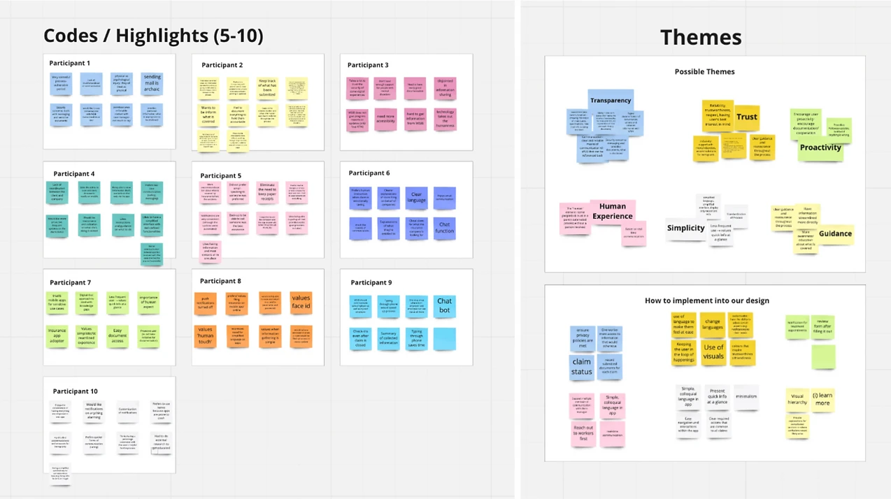
After the interview, the design team summarized the interview notes and placed key points into sticky notes on Miro. We found that the responses across all 15 participants ended up being very similar and we were able to summarize the points into 6 key themes:
Transparency
Trust
Proactivity
Human Experience
Simplicity
Guidance
Thematic Analysis
- Transparency
- Trust
- Proactivity
- Human Experience
- Simplicity
- Guidance
Thematic Analysis
- Transparency
- Trust
- Proactivity
- Human Experience
- Simplicity
- Guidance
UI Design
We begin the design process with sketches on paper. Here you can see our design iterations on the homepage from early sketches and low-fidelity prototypes to our final, high-fidelity prototype.
We begin the design process with sketches on paper. Here you can see our design iterations on the homepage from early sketches and low-fidelity prototypes to our final, high-fidelity prototype.

By the end of the 4 months, we have created a clickable prototype and high-fidelity designs of the onboarding screens, homepage, claims page, and forms page, as well as the proof of concepts for the payments, settings, and messaging page. Throughout the term, we had been constantly iterating our designs based on user research insights. Every design decision is backed up by an insight gained throughout our user research findings. We have chosen to use Figma to create our prototype as it is convenient for collaboration among multiple designers, as well as it is effective for design hand-off. We used both Figma and Zeplin for design hand-off to developers. All components used throughout the prototype referenced from the WSIB Design System and since we focused on designing for iPhones, we also referenced Apple's Human Interface Guidelines.
By the end of the 4 months, we have created a clickable prototype and high-fidelity designs of the onboarding screens, homepage, claims page, and forms page, as well as the proof of concepts for the payments, settings, and messaging page. Throughout the term, we had been constantly iterating our designs based on user research insights. Every design decision is backed up by an insight gained throughout our user research findings. We have chosen to use Figma to create our prototype as it is convenient for collaboration among multiple designers, as well as it is effective for design hand-off. We used both Figma and Zeplin for design hand-off to developers. All components used throughout the prototype referenced from the WSIB Design System and since we focused on designing for iPhones, we also referenced Apple's Human Interface Guidelines.
Usability Testing
Two rounds of usability testing were conducted to ensure all user confusion was identified. Firstly, we conducted a round of unmoderated usability tests on individuals who were not a part of the project in order to test whether or not our app is intuitive. We used the platform Maze to conduct the test, it gave us metrics such as the number of misclicks, task duration, and heat maps. After iterating the design, we then conducted a round of moderated usability tests to test our design changes. Lastly, heuristic evaluations were conducted by the designers.
Two rounds of usability testing were conducted to ensure all user confusion was identified. Firstly, we conducted a round of unmoderated usability tests on individuals who were not a part of the project in order to test whether or not our app is intuitive. We used the platform Maze to conduct the test, it gave us metrics such as the number of misclicks, task duration, and heat maps. After iterating the design, we then conducted a round of moderated usability tests to test our design changes. Lastly, heuristic evaluations were conducted by the designers.


Prototype Walkthrough
Here is the walkthrough of the MVP screens of the WSIB mobile prototype. Click here for our detailed deck of the mobile strategy project.
Here is the walkthrough of the MVP screens of the WSIB mobile prototype. Click here for our detailed deck of the mobile strategy project.
Key Takeaways
Using Zeplin and Figma for design hand-off to developers
Creating and utilizing the design system components throughout prototype
Usability testing our prototype with Maze
Conducting user interviews with real participants on userinterviews.com
Documentation of everything for future designers and corporate WSIB
Weekly Presentations, Meetings, and Decks and Demos